Visualizing Satellites and Space Debris
tl;dr: if you're looking for a pretty widget showing positions of satellites and space junk, go here.
Motivation
On Friday, I read an article about an artist named Michael Najjar who's hoping to go into space on SpaceShipTwo in 2014. One of the pieces of art featured in that article was a visualization that looked pretty cool of the space debris encircling the planet.
"Space debris" typically refers to pieces of defunct spacecraft (used-up rocket stages, dead satellites, etc.) floating above the earth. These pieces of space junk collide with each other (and, increasingly, with active satellites), generating more space junk in the form of high-velocity fragments. The result - as Najjar's art shows - is a mess.
Shortly thereafter, I was reminded of the existence of Google's WebGL Globe, which provides a convenient way of visualizing simple geographic data in 3D. I thought it would be interesting to see the results of mashing space debris data and the WebGL Globe together.
Getting the Data
The first step was acquiring the satellite data. NASA has an entire program office dedicated to space debris and a database of orbital objects called DISCOS tracking them all. After poking around for an hour or so I couldn't find anywhere that would allow me to get a snapshot of that database, and the Space Debris Program Office's website wasn't that much help, so I tried looking elsewhere.
Fortunately, I came across an article in Wired Science about tracking space junk using Google Earth using a file provided by Analytical Graphics (AGI). The Google Earth file referenced in the article downloads another KML file from AGI's servers on-demand. I'm not sure if this data is the latest snapshot of DISCOS, or if it's from some other database.
Tweaking WebGL Globe
Once I had that raw KML file, I wrote a simple script to extract the latitude, longitude and elevation of all objects that the file classified as "active satellites", "inactive satellites", or "debris". I then massaged that data into a form that the WebGL Globe could understand.
Visualizing the objects as lines starting from the ground was worthless, so I tweaked the globe's source to turn the lines into "points" (really, just short vectors) at the desired elevation.
Results
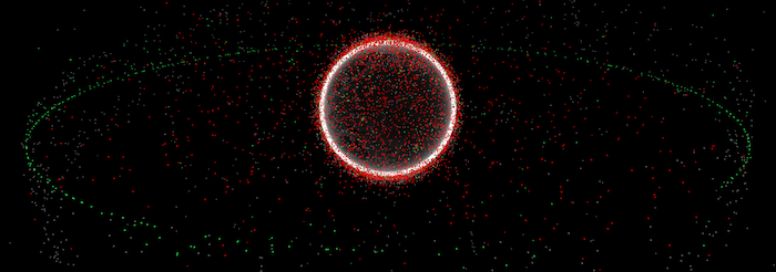
The resulting visualization is pretty nice, considering how little time it took to make it.
As far as I can tell this only really works on Google Chrome, which is kind of what you'd expect for something called a "Chrome Experiment". Your mileage may vary.
The elevation of the objects is not to scale; the ring of satellites in geostationary orbit should be about 5.6 Earth radii above the equator, and in the visualization they're only about 3 radii above. By the time I realized this, I already had something that I was satisfied with, and decided to leave it. To paraphrase Duke Ellington, "If it looks good, it IS good."
Availability
I've posted the source code and the raw data used to make this visualization on GitHub at alexras/orbital_objects.
Acknowledgments
Thanks to Adam Lucas' Processing project for providing part of the inspiration for this work.